Blue Telescope operates in a really unique space bringing high level visual effects to the non-fiction and immersive space. Give us a brief overview of what Blue Telescope does and how you landed at this nexus of work?
When we approach a project, we hone in on the story we’re there to tell, and use technology to bring it to life, creating rich, unique, and meaningful interactions. Whether it’s the story of an individual, institution, historical artifact, scientific concept, or brand, we like to create multiple doorways to invite people into these stories. Perhaps you’re unfamiliar with the subject of an exhibit, but you might find your way in through an adjacent approach — a pop culture angle, or a spectacular soundtrack, or an engaging gameplay experience.
Building multiple entry points into our stories is also a function of accessibility and inclusivity, which are at the foundation of what we do, both in our client work and internally at Blue Telescope. We believe that our company should be diverse because the world and audiences are diverse. Having interesting and different people, voices and life experiences leads to better work.
Our work has evolved in very strange ways. In 2000, when we started the company, we did a lot more corporate and pharmaceutical work. The internet was a baby. Interactive technology was a baby. We were there at the beginning, pushing for experiential design to be more interesting and meaningful than just pretty pictures. We’ve always been at the forefront of using technology to tell stories and connect with people in new ways, but for us these are just the tools that we use to expand the human experience of listening to each other.
You were able to win a Telly for “ Making the Nation’s Table” at The Africa Center x MOFAD.” Tell us about how this project came to life and what considerations were made in entering the Immersive, Interactive, & Mixed media categories.
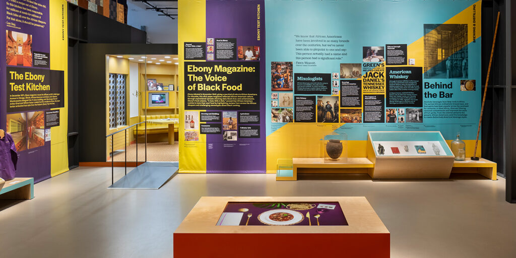
We love partnering with institutions who have fresh, imaginative approaches to storytelling. It was such an honor to be a part of a project with the author and culinary historian Dr. Jessica Harris, and the advisory panel full of luminaries and scholars who consulted on the exhibit. We were brought in towards the end of the project to take all of the extensive research and interpretive planning that they had done, and use that to create something striking and powerful for visitors to connect with in surprising and delightful ways.
The content that they had needed to really be presented in a vibrant and amazing way. It’s really important to us that if there’s a teenager walking past, they find it intriguing to come in, not just those who are already interested. It needed to be fresh, vibrant, young. It needed to be broken up into bite-sized pieces that made the experience more accessible, and visitors didn’t have to work too hard to come away with learnings.
We cared a lot about this project. It was a unique story we only knew bits and pieces of to start with, and we recognized how important it was to really dive in and make those connections resonate for visitors.
The Immersive, Mixed Media and Interactive categories seemed right because that’s what we do. Experiential storytelling should not be typical; you need to feel enveloped by the story, interact with the story, and find ways to bring joy and surprise to visitors.
We felt like this project exemplified the techniques of Mixed Media as we drew inspiration from the gorgeous Legacy Quilt that was commissioned for the exhibit from the Harlem Needle Arts group. Quilting is one of the oldest forms of gendered storytelling, and has played an important role throughout the history of African-American communities. We used these design elements — layers, colorblocking, embroidery — to tell the stories of the chefs and their food in the exhibit media. Since the space was small, this helped us to make sure that the design was impactful, recognizable, and immediate, while also paying homage to historic and cultural motifs.
Non-Fiction often aim to educate, inform, and sometimes persuade audiences. Was there anyone on your team with a documentary background to help ensure that the visual effects and animations effectively support the informative objectives of this piece?
Yes, our team has an extensive and varied background in film settings, and as a company we have a lot of experience producing non-fiction narratives – everything from documentaries, major films, high end commercials, and personal stories. Executive Creative Director, Judith Zissman, began her career with NFL Films and Miramax, and Founder Trent Oliver worked in film in Los Angeles. All of this has allowed us to guide many of our clients as we tell stories through film and interactive media.
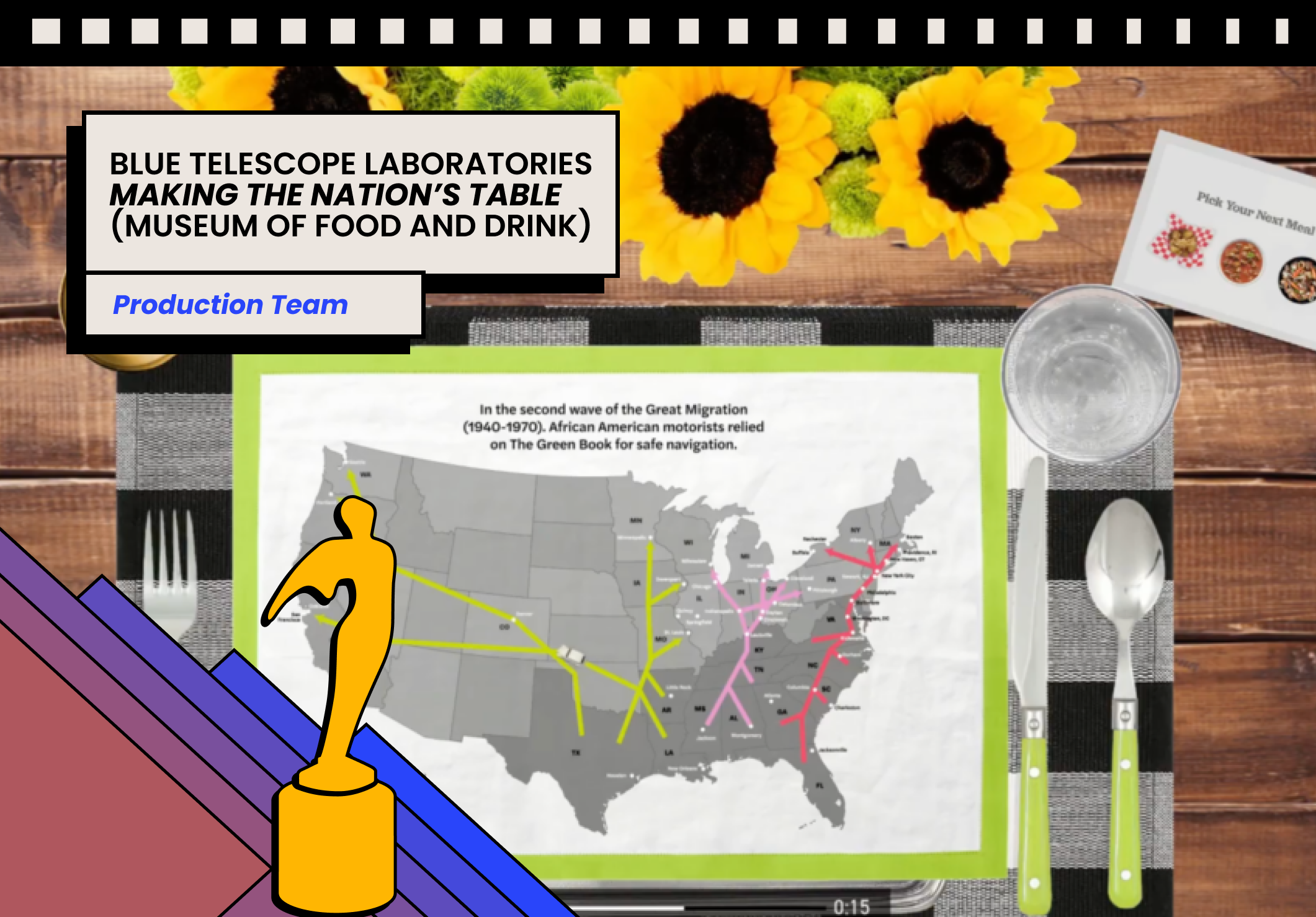
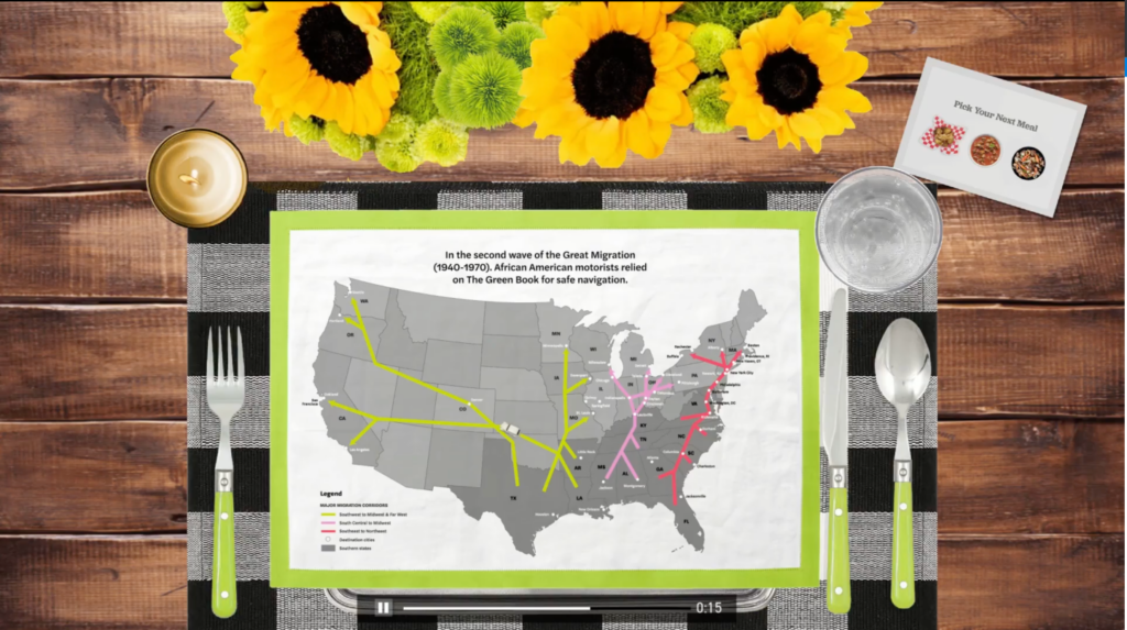
The curators had originally planned to display map images on the exhibit walls , but we felt that the central motif in a migration story is movement, and that the stories could be told much more powerfully through animation in a way that invited guests to move themselves through these stories along the same paths that the spotlighted people and ingredients moved.
The table place setting is its own character within this video. Tell us about the creative development and design of the table setting.
With food at the heart of this exhibit, it made sense to create a table-based experience and invite guests to share a meal. This allowed us to put something celebratory and joyous in the center of the room to help balance some of the heavier parts of the stories of slavery and forced migration.
Working with the curators, we selected iconic meals and recipes, such as pepper pot stew, to highlight the migration stories that led to the creation of those meals. Each meal has a festive place setting, with a napkin that opens into a map for each meal, invoking the embroidery from the quilts and adding context to the dish and its creators.
Film and video is an inherently collaborative endeavor. Tell us about your team and what it was like working together to make this piece.
This was a very tight deadline, as many of our projects are, which means we were developing in tandem and co-creating with our clients, which requires a lot of good communication and trust. We had to ensure that designs stayed grounded in what was possible to allow for rapid development, but we also wanted to push those designs as far as we could to create something new and exciting.
We keep our designs easy and inviting so that people can walk up and immediately know what to do, how to interact, etc, without making them feel put off by a technology barrier. To achieve this combination of innovative design and accessible technology, we rely on our incredible team, who have the chops to bring these new ideas to life.
Our team also had some personal connections to the content, which always offers richer perspectives.
Lead Creative Technologist, Ron Cunningham, recalls “I loved Dr. Harris’ Netflix series and book, High on the Hog, and feel a strong connection to the history, cuisines, and stories in this exhibit. Reese [our Creative Designer] provided authentic and fun art work for this interactive that really captured the various time periods and locations. It was exciting to be involved with this project.”
What was the most challenging part about this production and how did you and your team overcome this?
Timeline, hands down. There wasn’t a lot of time or money, but it needed to be effective and push boundaries. Luckily, we are very familiar with this kind of setup and are comfortable diving in headfirst.
The other major factor was Covid. When we started this project we were still facing a really limited supply chain and access to hardware, as well as little to no face-to-face time with our clients.
Tell us about what it was like to partner with The Africa Center x MOFAD.
These are two institutions that create really interesting exhibits and experiences. They’re innovative, visionary curators. The partnership with MOFAD brought us this fascinating story, and the partnership with The Africa Center gave us a really meaningful location.
The team had a strong vision, and they trusted us to interpret it. We care deeply about our client relationships, and we love interesting people — so we were perfectly aligned to build a deeper connection and understand their needs. It was also great to see how eager they were to collaborate with us and make sure everyone got to dream about how it would be done.
They were also really great on the approval process – quick, clear and honest – which allowed us to work quickly and efficiently.
What does winning a Telly Award mean to you?
It’s an honor to be recognized among other exciting projects across the industry. There are so many powerful stories across the world, and it’s a privilege to get to tell them. The award also helps connect us with people who might not come across our work in other ways and see the value in it.
We love being a part of this community and hope to continue for decades to come.
We also want to thank everyone on our team who helped to bring this project to life: Trent Oliver, Judith Zissman, Dustin Stephan, Ron Cunningham, Reese Patillo, and Wendy Wen.

